In the late 1980s, a prolific trader – and now billionaire – Paul Tudor Jones predicted the 1987 stock market crash by comparing two ten-year charts – one from the 1920s and one from the early 80s (to be accurate and give credit where it’s due it was actually his assistant that first discovered correlation, but for simplicity’s sake let’s use Paul).
Since then, many traders have tried to emulate this method of prediction and, while many have failed, some have had a reasonable amount of success. The field of technical analysis suggests that historic price action is relevant, after all.
How applicable traditional technical analysis – and in turn the study of historic price charts – is to the digital currency space is still very much an unanswered question, but here at NewsBTC we spotted an interesting correlation between two longer-term bitcoin-dollar charts that we thought may be of interest (if only for a little bit of light entertainment) to our readers. I reiterate, don’t take this too seriously – it is just a little bit of fun – but take a look nonetheless.
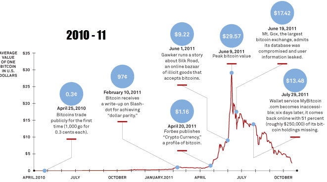
The first chart shows bitcoin action across the two-year period 2010-2011 – with the rally up to $35 and the ensuing crash back down to below 5. For reference, this chart was taken from a Wired magazine article printed back in 2011. Now take a look at the second chart.
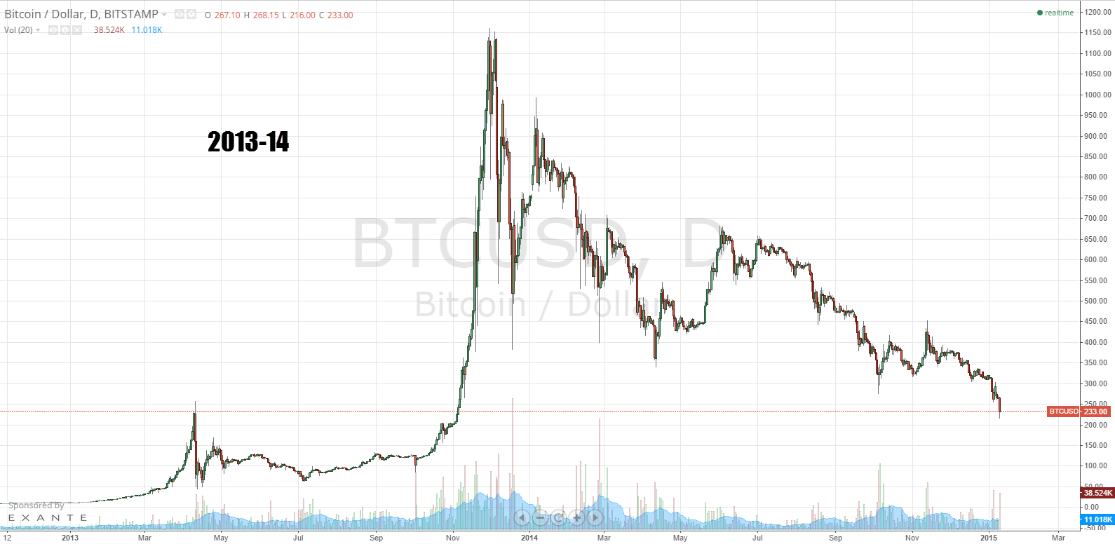
Notice any correlation? It is hard not to. Again, this is just for fun, but after recovering from the crash throughout 2012, we all know what happened to bitcoin throughout 2013. History tells us that bubbles follow the same patterns over and over again, just at different price levels. Is this the case with bitcoin do you think? Nobody really knows – but it sure makes for interesting water cooler conversation!